Breif


Task - the way we look at work (people working) in what ever way we look at it
research into magazines and magazine culture
styles of pages
picture post , ad-busters ,the face,the guardian, GQ, Another magazine ,Nylon , Arena ,Sleazenation
how have photographers represented work in the past? examples
Construcivism - rodchenko
stick with my area of interest
practically experiment with images - collages etc , scale
mock up magazines
layouts
paintings of people working
lewis hine
martin Parr
prostitues
scale within the photograph
symmetry
bunker- albion
What is an editorial photographer?
http://www.steves-digicams.com/knowledge-center/how-tos/photography-tips/how-to-become-an-editorial-photographer.html#b
How to Become an Editorial Photographer
An editorial photographer's primary responsibility is to deliver a unique, appealing and marketable story in its best form in a short amount of time. Whether he is swinging from a tree in Africa or taking shots of models in a swimming pool, he is always trying to create an image that is congruent with the Editor's vision.
His journey to his current position has been long and arduous, with potentially humble beginnings and an uncertain career end. It has involved long hours, little to no pay, persistent networking, business negotiation, self-branding, innovation and drive. Unlike his colleagues who dropped out of the profession long ago, this individual was able to combine all these qualities with his educational background and natural talent and create a name for himself in a demanding, politically-driven environment.
An aspiring Editorial Photographer should take classes through a local community college or university, master the various techniques they learn and cultivate their ability to tell a story with their camera. He should also consider combining photojournalism and creative photography classes with courses in the liberal arts, sciences or another field of interest. If he has already worked in another field and wants to turn his photography hobby into a career, he can turn his work experience into a photography niche.
The aspiring Editorial Photographer's brand can be a creative spin on another passion or interest of his, or it can be a visual depiction or story of his former life as a Nurse, Businessman, Construction Worker or Ballet Dancer. A photographer's niche can also be devoted to different publications he reads.
No matter what his brand may be, the most important thing for him to understand is that his brand must be specialized, unique, innovative, and recognizable and marketable; it must stand out to the masses, appeal to editors, be sellable enough to survive in a market and be stable enough to capitalize on other photographers' brands.
Once the aspiring photographer has established his personal brand, he needs to build a portfolio and Web site around it. An aspiring photographer's portfolio should never be a conventional and generalized arrangement of wedding photos, pictures of animals, children, and other expected pieces. His portfolio pieces should be original, showcase his talent, display his mastery of the craft and portray how he can add to the magazine's content.
An incumbent's success in obtaining a photography assistantship is rooted in his reliability, talent, persistence, and drive, so it is important that the aspiring Editorial Photographer shows all of these qualities when he is prospecting for an assistantship.
Assistantships are easy to get if the candidate calls or e-mails the photographer, sends her his photographs and follows up with her regularly about the position. Once he has begun working as an Assistant Photographer, he needs to build a stable reputation in the industry.
Editorial Magazine research
What is editorial photography?
http://www.editorialphoto.com/resources/faq.asp#anchor1
"Editorial" refers to the market where the images will be used -- primarily books, magazines, and newspapers -- and, to a lesser extent, to the style of photography that appears in these venues. We use the term editorial to distinguish it from other markets like corporate, advertising, general commercial, or fine art. Most editorial outlets offer a fair amount of creative freedom, but also extremely low budgets compared to other venues.
What is an editorial photographer?
http://www.steves-digicams.com/knowledge-center/how-tos/photography-tips/how-to-become-an-editorial-photographer.html#b
How to Become an Editorial Photographer
An editorial photographer's primary responsibility is to deliver a unique, appealing and marketable story in its best form in a short amount of time. Whether he is swinging from a tree in Africa or taking shots of models in a swimming pool, he is always trying to create an image that is congruent with the Editor's vision.
His journey to his current position has been long and arduous, with potentially humble beginnings and an uncertain career end. It has involved long hours, little to no pay, persistent networking, business negotiation, self-branding, innovation and drive. Unlike his colleagues who dropped out of the profession long ago, this individual was able to combine all these qualities with his educational background and natural talent and create a name for himself in a demanding, politically-driven environment.
Develop A Technique
A Bachelor of Fine Arts or a Master of Fine Arts in Photography is not always necessary for becoming an Editorial Photographer. In fact, a majority of Editorial Photographers come from careers in education, the liberal arts, science, medicine, technology and business.An aspiring Editorial Photographer should take classes through a local community college or university, master the various techniques they learn and cultivate their ability to tell a story with their camera. He should also consider combining photojournalism and creative photography classes with courses in the liberal arts, sciences or another field of interest. If he has already worked in another field and wants to turn his photography hobby into a career, he can turn his work experience into a photography niche.
Find Your Niche and Build an Original Portfolio
Editorial Photographers usually hold additional experience in some other field (culinary arts, wildlife, business, etc.), which they use to create a unique personal brand that consumers and industry professionals will recognize.The aspiring Editorial Photographer's brand can be a creative spin on another passion or interest of his, or it can be a visual depiction or story of his former life as a Nurse, Businessman, Construction Worker or Ballet Dancer. A photographer's niche can also be devoted to different publications he reads.
No matter what his brand may be, the most important thing for him to understand is that his brand must be specialized, unique, innovative, and recognizable and marketable; it must stand out to the masses, appeal to editors, be sellable enough to survive in a market and be stable enough to capitalize on other photographers' brands.
Once the aspiring photographer has established his personal brand, he needs to build a portfolio and Web site around it. An aspiring photographer's portfolio should never be a conventional and generalized arrangement of wedding photos, pictures of animals, children, and other expected pieces. His portfolio pieces should be original, showcase his talent, display his mastery of the craft and portray how he can add to the magazine's content.
Gain Experience by Assisting a Professional Photographer
The best way for an aspiring Editorial Photographer to gain experience, contacts, and industry exposure is through a one-year assistantship with an established, connected, and reputable photographer. If the photographer is willing to add an assistant photographer to his team, the assistant's pay will be low or nonexistent, his tasks will be menial and his desire to become an Editorial Photographer will be tested.An incumbent's success in obtaining a photography assistantship is rooted in his reliability, talent, persistence, and drive, so it is important that the aspiring Editorial Photographer shows all of these qualities when he is prospecting for an assistantship.
Assistantships are easy to get if the candidate calls or e-mails the photographer, sends her his photographs and follows up with her regularly about the position. Once he has begun working as an Assistant Photographer, he needs to build a stable reputation in the industry.
Build a Reputation and Know the Market
An Editorial Photographer's success is defined by his talent, originality and the reputation he has built in the industry. His employability revolves around whether he can work ahead of a deadline, negotiate well, follow through with promises and deliver strong content in a short amount of time. Since the publishing industry is driven by relationships and credentials, the connections and portfolio he built through his assistantship will be vital to his independent success.Editorial Magazine research
Ronel Van Heerdan (flickr)


Kapil vashist

matching colour throughout the layout , image as the main focus and little text.

Baby and maternity magazines (scrapbook type magazines)

Wenkars ( flickr)
Victoryag79
I do like the idea of making the layout look more scrap book styled as-though the child has had inspiration throughout the actual layout

Decide on a concept to do with work - childminder
women on maternity leave
pregnant women at work - how people pus them out
Littles magazine
source - http://www.littlies.co.nz/page.asp?id=839


Bright vibrant colours to match with the weather in the images?

match the text to the colour in the photos


actual hand-drawn writing on the layout to make it look more personal
bethanyjoscott@me.com
beth- collaberted graphic design partner?
Ideas put together from the discussion with the graphic designers
Ideas put together from the discussion with the graphic designers
bright colours
layered photos
connected with colours
stitching borders
chalkboards
crayon textures
personal images
finger painting
pull out people cut outs
child minder
plain background
building blocks - image son building blocks
framed images on walls with hanging pictures etc
photos held on by magnets on a fridge
postit notes
film reel
Fonts and colours
source:

Home and heath outline bold font
I like the feel of this font , it has a sketchy appearance and but doesn't look too hand written that it wont look unprofessional on a spread.

Typo garden demo font

Patchwork letter font
Baby blocks font
VTKS embroidery font
Molly font
something similar to this font would suit the quotes and smaller text more in the spreads
Wonderland font
RYP child font
Mock ups

Here is a very rough layout done on photoshop , I have tried to match up colours etc with the images and sampled a font.
Layouts from Chris (graphics design student)


Here is the layout the graphic design student I was collaborating with designed for me, I suggested using stitching on borders which he has done effectively and possibly small building blocks with pastel colours , I feel as though this layout is aimed more towards children in a children magazine rather than parents. I suggested using more brighter colours and to loose the blacks.


The colours are much more suited on this layout but I still feel the aimed audience is children rather than parents.
Editorial Proposal
For the editorial brief I am collaborating with Chris from graphic design. I am exploring editorial in the form of mothers and children and the working environment around them , I am focusing of the role of a child minding whilst also being a parent. I plan to photograph my mums friend child minding in her and the children’s natural environment, I often see her walking the children to school so it could either be the journey or the documentation of the whole day from morning to when the children return to their parents and what that involves.
typical activities I would like to show:
Nap time
dinner time
cleaning up
making the food
story time
craft time
walks
one on one time
cuddles and interactions with one another
Nap time
dinner time
cleaning up
making the food
story time
craft time
walks
one on one time
cuddles and interactions with one another
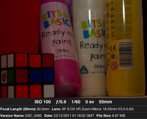
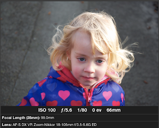
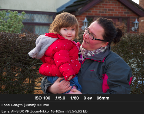
My test images so far


A few favourite images
original

brightened image

close up images of the objects used in activities will go nicely together with each activity on a magazine layout.


A clear image packed with different emotions, the personalities are beginning to come through the images more now.


Editorial photography research
Tom Hussey
Reflections series


Sean Dufrene
Playdate


Cherries and Knives


Brad Vest


Initial Ideas
1. 'what I want to be when I grow up'
inspired by the reflection series by Tom Hussay I thought of my own way I could put my stamp on it , as my specialism is children I would like to photograph them in there home comforts doing what they love the most , looking through a mirror and the reflection would be there idols or what they want to be when they grow up, eg fireman, policeman, nurse etc , using children from different ages and backgrounds perhaps to show childrens attitudes towards careers and jobs.
2. documentation of the news of a pregnancy from day 1-7
a photographic documentation of the news of a new arrival , from different mothers and fathers in different situations.
3. Young mums and old mothers
photographing younger mothers and older mothers in there home comforts looking after their child/children to see any difference in upbringings and how jobs can effect this.
4. Quotes
photographing a quote that can be reinacted with families or children etc
5. 'too much too young'
photographing babies and children in adult situations eg , baby sat in an office with a suit on etc
6. significant objects
photographing a work/home enviroment with significant objects being the focus.
7. stereotypes in jobs
photographing stereotypes in a workplace .
After exploring other possible ideas I have decided to further the idea of 'the way we work'
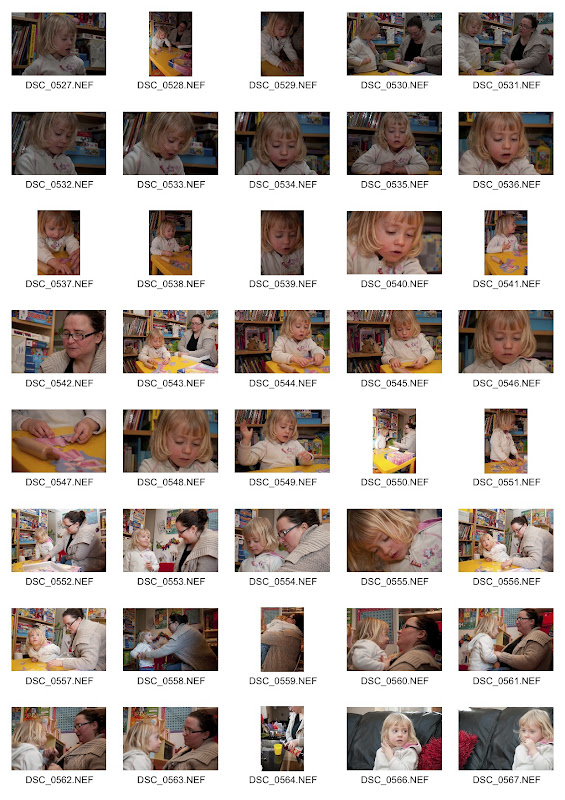
as I feel it is a really strong subject and it links to the genre of photography I am mainly interested in. I am going to do several more photosessions at childminder wendy, and photograph from morning to after lunch to document through photographs the activities throughout the day and interview wendy to understand more about her job and why she has decided to work from home. I want the story to be more based on wendy and the relationship she has with her work and how others see it also. Here is the first photosession contact sheet from morning 8.00am until 2.00pm.


editorial session three
I decided to go round one last time as wendy was having an extra child on this day so i wanted to see how they all interacted and how this child was different to others. This child was very unsociable and unlike the other two wendy child-mind's, I was shocked to see as I walked in the room the little girl burst into tears for no reason at all. I had already been warned that amy ( extra child) wasn't very social-able and got upset and moody very easily, this was difficult at first to photograph her without this mood being shown but I figured it was best to show her naturally so this it was I did.It was interesting to see throughout the day the child develop and become less moody and slightly more open, I even managed a smile from her! On this session wendy was taking the children to the nearby woods and pond to feed the ducks.


chosen images


 Although it may not be seen as one for the family photo album I felt this was a strong image that captured each individuals personality,and true emotions at the time.


magazine layouts
I decided to try and design a magazine layout myself as I was not satisfied with the layout that my graphic designer had done for me , simply because I felt it focused too much on the child side of it and didnt relate to parents of children also. I decided to try and design a layout on indesign rather than photoshop to try and learn new skills on different softwares. Before I was to try this I decided to look at some tutorials to answerr any questions I had at all.
How to text wrap in indesign
How do you change the background colour on indesign?
http://forums.creativecow.net/thread/139/855305
Although there are scripts out there that allow you to actually change the background color, a general way is as follows:
- Make a new layer (Windows>Layer to show layer palette)
- Drag out a Rectangle or Frame Rectangle (Rectangle tool of Rectangle Frame tool) to fit the size of your document.
- Make that rectangle's fill color the color you want your background (select it & use the swatches palette).
That's it. You can now lock that layer if you like.
If you were doing a multi-page document, you'd want to do the above on a Master page.
Further research into simple magazine layouts
(www.flickr.com)


Here are a few of my own attempts and how the designs have changed and improved slightly.
I have used some text from a website which isnt relevant to the layout it was just to make up the text section.


A walk in the park
As I wanted to document the whole day in the images I have designed a few different magazine layouts which include images from each important part of the day , this is a walk in the park.
 After looking at this layout on preview I realised it had too many photos and took the focus away from what the images where trying to show , I originally wanted to have a portrait of each child wendy child-minded on the days I photographed but realised I have photographs of them all on each layout just with other children. I have submitted the portraits of the children just to show each image and how it shows there personality.I also feel that the coloured text cheapens the layout and makes it look less professional so in the next layout I will use black text.

I wanted to show the way that wendy allows the children to be free with what they do and allow them to develop there own skills in role play, crafts and reading etc. I have included a small amount of images just to show the basics , there was a lot of photographs I wanted to include but there was too many to choose from. I have also included quotes on each layout from the interview I had with wendy.


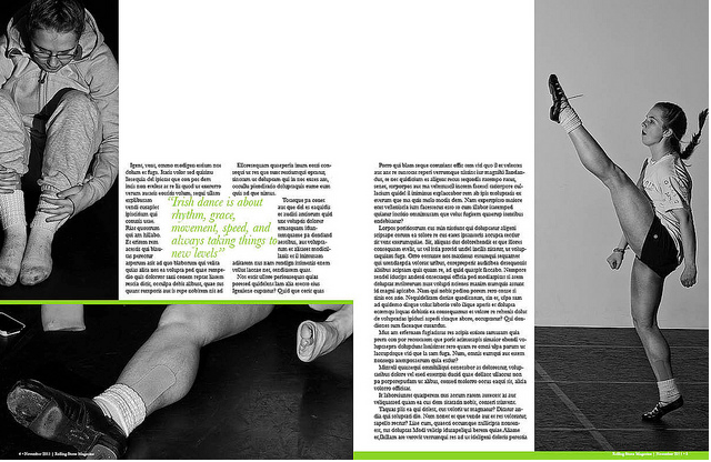
final magazine layouts


Report
I felt that my weaknesses fall under choosing the final images as I had so many in which I wanted to use I found it difficult to choose images which would relate to one another and tell the story, I found that the images I liked the most I didn’t use as they didn’t show the relationship between the subject or show the activities. My strengths were my communication skills with each subject I felt that I tried hard to read each subjects personality and show that through the images in a natural way.
word count 550
Playdate


Cherries and Knives


Brad Vest


Initial Ideas
1. 'what I want to be when I grow up'
inspired by the reflection series by Tom Hussay I thought of my own way I could put my stamp on it , as my specialism is children I would like to photograph them in there home comforts doing what they love the most , looking through a mirror and the reflection would be there idols or what they want to be when they grow up, eg fireman, policeman, nurse etc , using children from different ages and backgrounds perhaps to show childrens attitudes towards careers and jobs.
2. documentation of the news of a pregnancy from day 1-7
a photographic documentation of the news of a new arrival , from different mothers and fathers in different situations.
3. Young mums and old mothers
photographing younger mothers and older mothers in there home comforts looking after their child/children to see any difference in upbringings and how jobs can effect this.
4. Quotes
photographing a quote that can be reinacted with families or children etc
5. 'too much too young'
photographing babies and children in adult situations eg , baby sat in an office with a suit on etc
6. significant objects
photographing a work/home enviroment with significant objects being the focus.
7. stereotypes in jobs
photographing stereotypes in a workplace .
After exploring other possible ideas I have decided to further the idea of 'the way we work'
as I feel it is a really strong subject and it links to the genre of photography I am mainly interested in. I am going to do several more photosessions at childminder wendy, and photograph from morning to after lunch to document through photographs the activities throughout the day and interview wendy to understand more about her job and why she has decided to work from home. I want the story to be more based on wendy and the relationship she has with her work and how others see it also. Here is the first photosession contact sheet from morning 8.00am until 2.00pm.


I wanted to capture each child individually to show each personality, this is Isabelle , she is known as the 'smiley one' she is such a pleasant happy child.


This is sophie , on the first shoot she was very shy and more reserved but came out of her shell alot more after she had seen me a few more times, she is the loveable child , sophie is very affectionate towards other children and adults once she gets to know you. She is also very intelligant often correcting wendy (childminder) with what she says.


Sophie is a very independent child too, Wendy said in her interview that she tries to encourage them to do things themselves rather than always relying on other, sophie has picked this up and was often seen wandering off in her own little world often looking back at wendy for reassurance though.


editorial session three
I decided to go round one last time as wendy was having an extra child on this day so i wanted to see how they all interacted and how this child was different to others. This child was very unsociable and unlike the other two wendy child-mind's, I was shocked to see as I walked in the room the little girl burst into tears for no reason at all. I had already been warned that amy ( extra child) wasn't very social-able and got upset and moody very easily, this was difficult at first to photograph her without this mood being shown but I figured it was best to show her naturally so this it was I did.It was interesting to see throughout the day the child develop and become less moody and slightly more open, I even managed a smile from her! On this session wendy was taking the children to the nearby woods and pond to feed the ducks.


This is sophie trying to figure out what leaf it is she was holding , wendy often brings them to the woods and gets them touching the leaves for different senses, and here is sophie trying it herself.


magazine layouts
I decided to try and design a magazine layout myself as I was not satisfied with the layout that my graphic designer had done for me , simply because I felt it focused too much on the child side of it and didnt relate to parents of children also. I decided to try and design a layout on indesign rather than photoshop to try and learn new skills on different softwares. Before I was to try this I decided to look at some tutorials to answerr any questions I had at all.
Questions I found myself asking?
How to save a file as a jpeg in indesign
[http://help.adobe.com/en_US/indesign/cs/using/WS840FD996-A786-4311-93B2-846AB3659ED2a.html ]
JPEG uses a standardized image compression mechanism to compress full-color or grayscale images for onscreen display. Use the Export command to export a page, spread, or selected object in JPEG format.
- If desired, select an object to export. (You do not need to select anything to export a page or spread.)
- Choose File > Export.
- Specify a location and a filename.
- For Save As Type (Windows) or Format (Mac OS), choose JPEG, and click Save.The Export JPEG dialog box appears.
- In the Export section, do one of the following:
- Selection
- Export the currently selected object.
- Range
- Enter the number of the page or pages you want to export. Separate numbers in a range by using a hyphen, and separate multiple pages or ranges by using commas.
- Select All
- Export all pages in the documents.
- Spreads
- Export facing pages in a spread to a single JPEG file. Deselect this option to export each page in a spread as a separate JPEG file.
- For Quality, choose from a range of options that determine the trade-off between file compression (smaller file size) and image quality:
- Maximum includes all available high-resolution image data in the exported file and requires the most disk space. Choose this option if the file will be printed on a high‑resolution output device.
- Low includes only screen-resolution versions (72 dpi) of placed bitmap images in the exported file. Choose this option if the file will be displayed onscreen only.
- Medium and High include more image data than Low, but use varying levels of compression to reduce file size.
- For Format Method, choose one of the following options:
- Progressive displays a JPEG image in increasing detail as it is downloaded to a web browser.
- Baseline displays a JPEG image after it has been downloaded completely.
- Select or type the resolution for the exported JPEG image.
- Specify the color space of the exported file. You can choose to export as RGB, CMYK, or Gray.
- Select any of the following items, and then click Export.
- Embed Color Profile
- When this option is selected, the document’s color profile is embedded in the exported JPEG file. The name of the color profile is displayed in small text to the right of the option. You can select the desired profile for the document by choosing Edit > Assign Profiles before exporting to JPEG.
If Gray is chosen from the Color Space menu, the Embed Color Profile option is disabled.
- Use Document Bleed Settings
- If this option is selected, the bleed area specified in Document Setup appears in the resulting JPEG. This option is disabled if the Selection option is chosen.
- Anti-Alias
- Anti-aliasing smooths the jagged edges of text and bitmap images.
- Simulate Overprint
- This option is similar to the Overprint Preview feature but works for any of the selected color spaces. If selected, the JPEG file that InDesign exports simulates the effects of overprinting spot inks with different neutral density values by converting spot colors to process colors for printing.
How to text wrap in indesign
How do you change the background colour on indesign?
http://forums.creativecow.net/thread/139/855305
Although there are scripts out there that allow you to actually change the background color, a general way is as follows:
- Make a new layer (Windows>Layer to show layer palette)
- Drag out a Rectangle or Frame Rectangle (Rectangle tool of Rectangle Frame tool) to fit the size of your document.
- Make that rectangle's fill color the color you want your background (select it & use the swatches palette).
That's it. You can now lock that layer if you like.
If you were doing a multi-page document, you'd want to do the above on a Master page.
Further research into simple magazine layouts
(www.flickr.com)

I find the use of quotes in the middle of the pages is effective and makes the story more clear.
the use of text wrap makes the words stand out more and is more aesthetically pleasing on the page.

This is my favourite layout , it is simple and easy reading , not too many images and the colours of the text fit the colours in the images.


Here are a few of my own attempts and how the designs have changed and improved slightly.
I have used some text from a website which isnt relevant to the layout it was just to make up the text section.


I changed this one slightly and curved the edges of the images to see what effect it gave , I felt it looked unprofessional, I have decided to change the font of the quote too and use a simple black text instead.

I have added a border to this one and changed the font , I prefer the font used but the border takes too much away from the images.

Still using a border but using a less brighter colour , I found a font from www.dafont.com and used that for the quote which is alot more effective.

Here is the layout without the border which I feel looks alot more slick and professional.

I noticed on the above layout that the gap was too large between the pages so I altered it slightly on here to get the final layout.
As I wanted to document the whole day in the images I have designed a few different magazine layouts which include images from each important part of the day , this is a walk in the park.


After comparing the two layouts I feel that this layout works a lot better, the images combine to tell a story and the text isn't overcomplicating the layout.
A child's creativity
I wanted to show the way that wendy allows the children to be free with what they do and allow them to develop there own skills in role play, crafts and reading etc. I have included a small amount of images just to show the basics , there was a lot of photographs I wanted to include but there was too many to choose from. I have also included quotes on each layout from the interview I had with wendy.

Here is my first layout I did but I felt like it didn't match up somehow so I have done another layout and just moved the text and images around to make the spread look more even. I feel that the images match and tell the story of Wendy's craft/story time and capture the real emotions of the children and wendy.

Here is the final layout with the images and text swapped round which works alot better as a layout and is easier to read as a spread.
final magazine layouts
From first receiving the brief 'the way we look at work' I knew instantly the topics I was interested in relating to work and how people see it. My initial ideas were to explore midwifery but I realized there would be many legal boundaries that would delay/stop me in doing this, I was also interested in documenting a pregnant worker to show how others treat women at work whilst being pregnant differently to others, as the models place of work was at a chemist they wouldn't allow photography in the workplace with there being peoples private documents on show and I figured trying to reinact the place of work just wouldn’t work the same. Eventually I found an idea, which could show a lot of stories within the images, - a child minder. I wanted to show through my images the relationship in which ‘Wendy’ the child minder has with the children she looks after and the activities she does throughout her day. I thought this would be a strong subject to photograph as she works from home and often people look differently at people that work from home rather than at a placement.
Overall I did three photoshoots each one with different activities indoors and outdoors. I treated my first photoshoot as a test shoot focusing on the colours in the images and mainly trying to capture the subject’s personalities through the images and the relationships with one another. Looking back I feel that it worked well as a test shoot and helped me to further develop the idea into something more personal and detailed. I feel the images from the test shoot were darker than my others and had to be made slightly lighter through Photoshop cs5. The second and third following photoshoots I recorded an informal interview with Wendy talking to her about several things that was involved with the job, I initially wanted to use this as a full interview in the layout but there wasn’t enough to make it into a full more formal interview so I cut sections out and used them as quotes on the layouts which worked more effectively with my design.
Originally I was collaborating with a graphic design student but the design wasn’t right for what I wanted and I felt it didn’t go with my photographs and related more to a younger audience rather than parents, so I decided to do my own layouts instead. I was initially going to design the layout on Photoshop but figured it was more beneficial to use indesign as it was new software that I hadn’t used before. I thought it was best to keep the designs simple and to keep the focus on the story of the images.
I felt that my weaknesses fall under choosing the final images as I had so many in which I wanted to use I found it difficult to choose images which would relate to one another and tell the story, I found that the images I liked the most I didn’t use as they didn’t show the relationship between the subject or show the activities. My strengths were my communication skills with each subject I felt that I tried hard to read each subjects personality and show that through the images in a natural way.
word count 550